reu
Maintaining close relationships throughout life...
UI / UX Designer & Research Lead
Overview
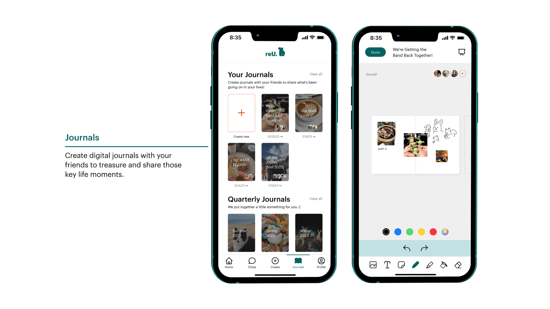
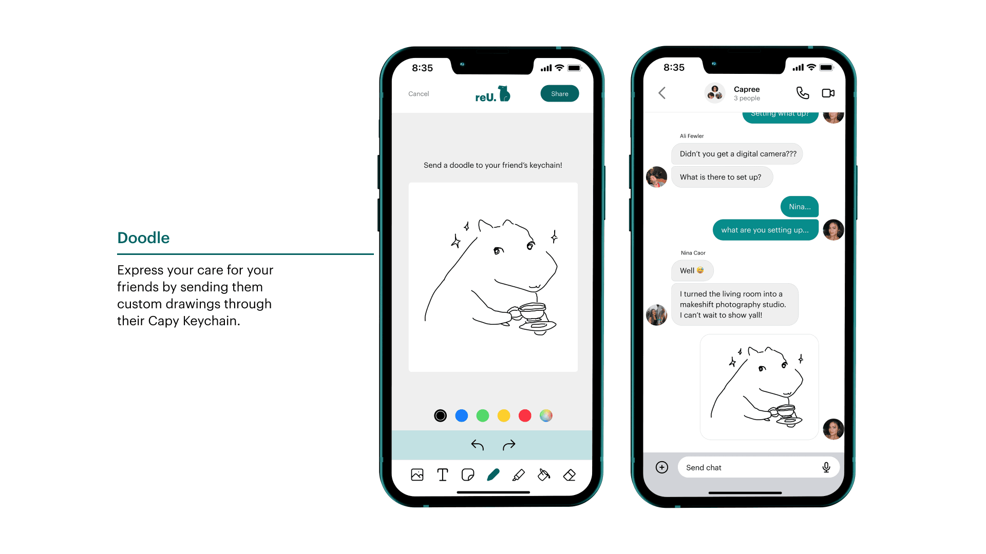
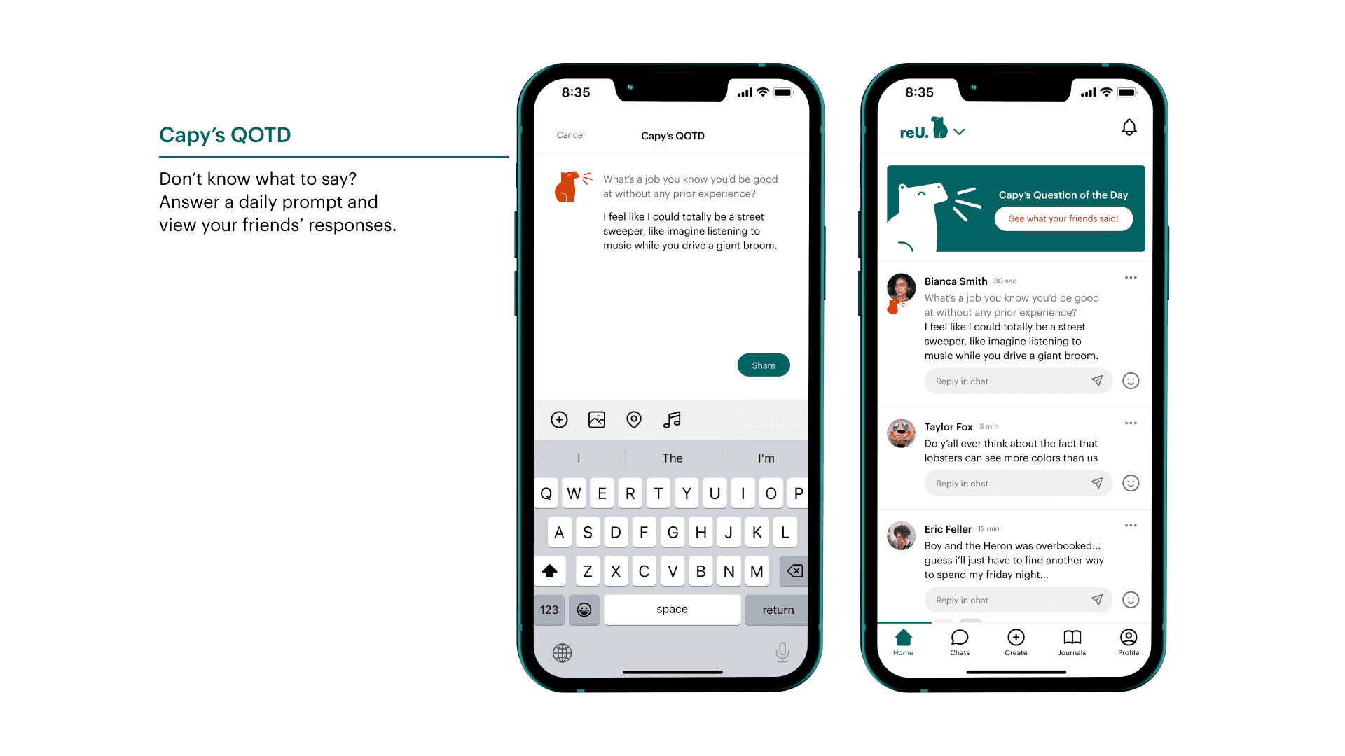
reU is a platform built for people to sustain and support their friends through their growth and life achievements without worrying about distance. By promoting meaningful interactions with tools like journals and doodles, and features that encourage reflection, celebration, and memory preservation, reU aims to strengthen friendships and allow users to navigate through life with strong and sincere connections.
Problem Statement
Recently, young adults have seen a noticeable decline in the quality and quantity of their friendships. This issue has significant implications for these young adults' wellbeing and social development. One contributor can be attributed to the challenging transitional periods that young adults go through, such as completing education, entering the workforce, moving, and many other major life changes. Whether exciting or stressful, these periods disrupt social connections making it difficult for young adults to maintain friendships.
While going through transitional periods in their lives, young adults have trouble maintaining and deepening pre-existing friendships, leading to loneliness.
Research Methods
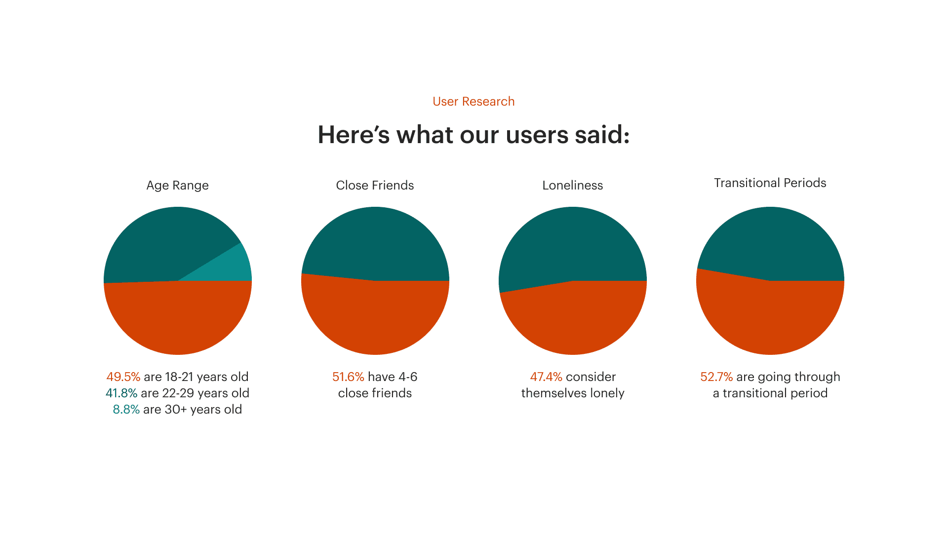
To tackle our problem, we needed to understand our users and their thoughts, so we conducted two round of surveys and three interviews.
In our surveys and interviews, we were exploring if transitional periods were even affecting friendships and if our users liked any of our initial features. We found a correlation between users that considered themselves lonely and if they were going through a transitional period. This led us to our guiding goals:
How might we create meaningful and interesting conversations to encourage interpersonal connections between users and their friends?
How might we incorporate collaboration to create a sense of community?
How might we make sharing day-to-day life engaging for users?
How might we create a simple-to-use and easy-to-understand platform to match the system and the real world?
Research Methods
To tackle our problem, we needed to understand our users and their thoughts, so we conducted two round of surveys and three interviews.
In our surveys and interviews, we were exploring if transitional periods were even affecting friendships and if our users liked any of our initial features. We found a correlation between users that considered themselves lonely and if they were going through a transitional period. This led us to our guiding goals:
How might we create meaningful and interesting conversations to encourage interpersonal connections between users and their friends?
How might we incorporate collaboration to create a sense of community?
How might we make sharing day-to-day life engaging for users?
How might we create a simple-to-use and easy-to-understand platform to match the system and the real world?
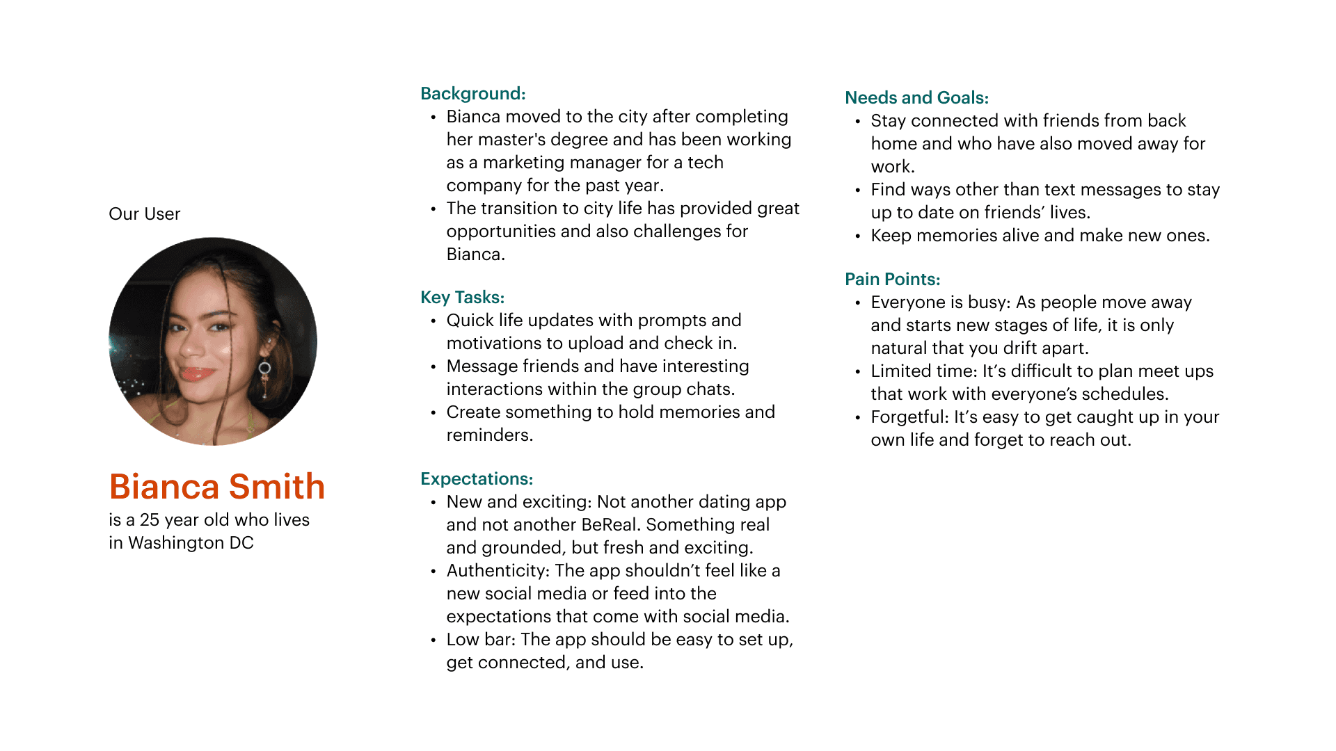
Who is ReU for?
Market Analysis
While our closest competitors, Cappuccino and Letter Loop, do a great job of fostering real, personal connections, their user retention is low. This allows us to optimize unique features and interactions to keep people engaged
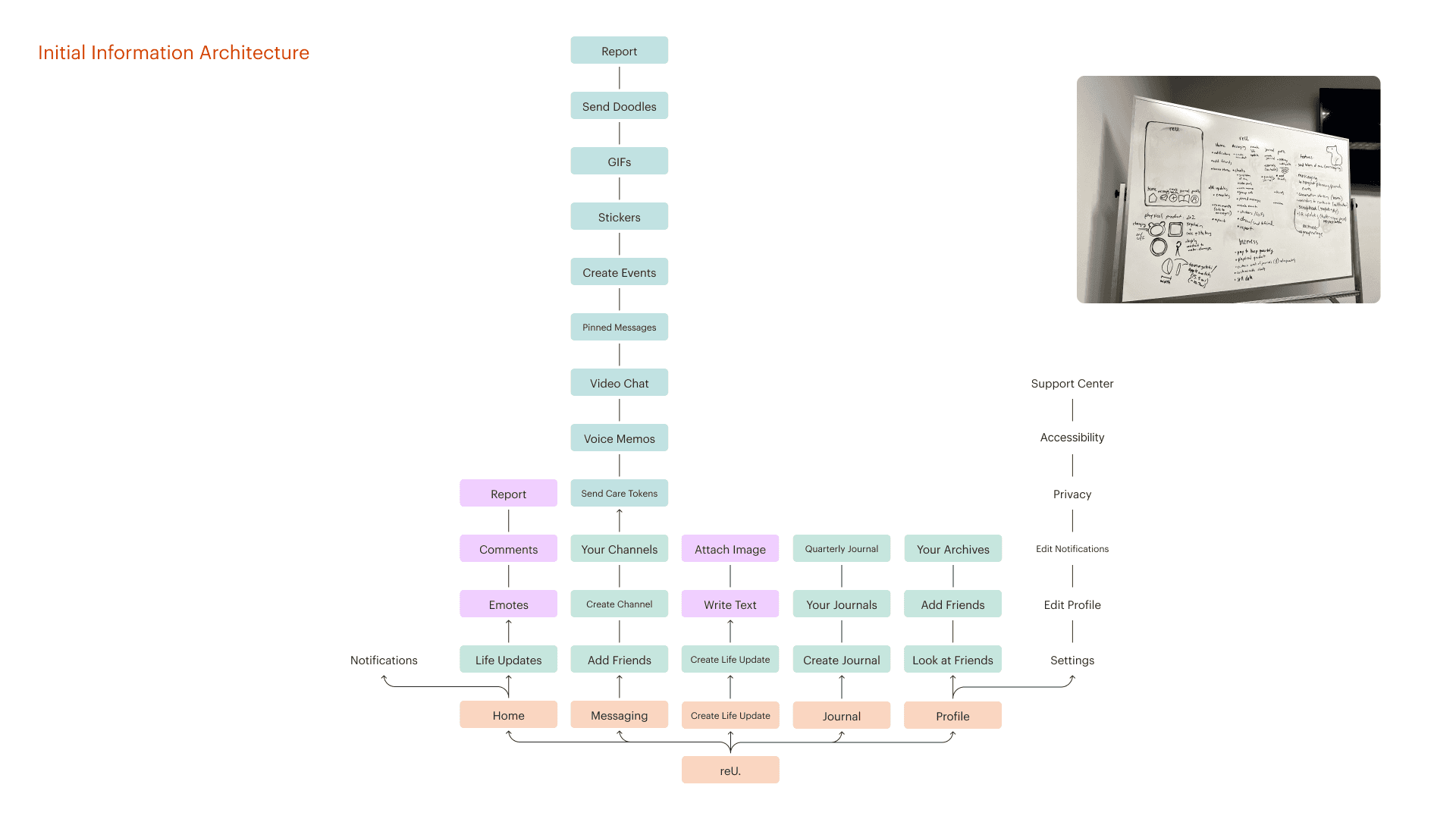
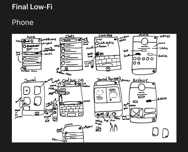
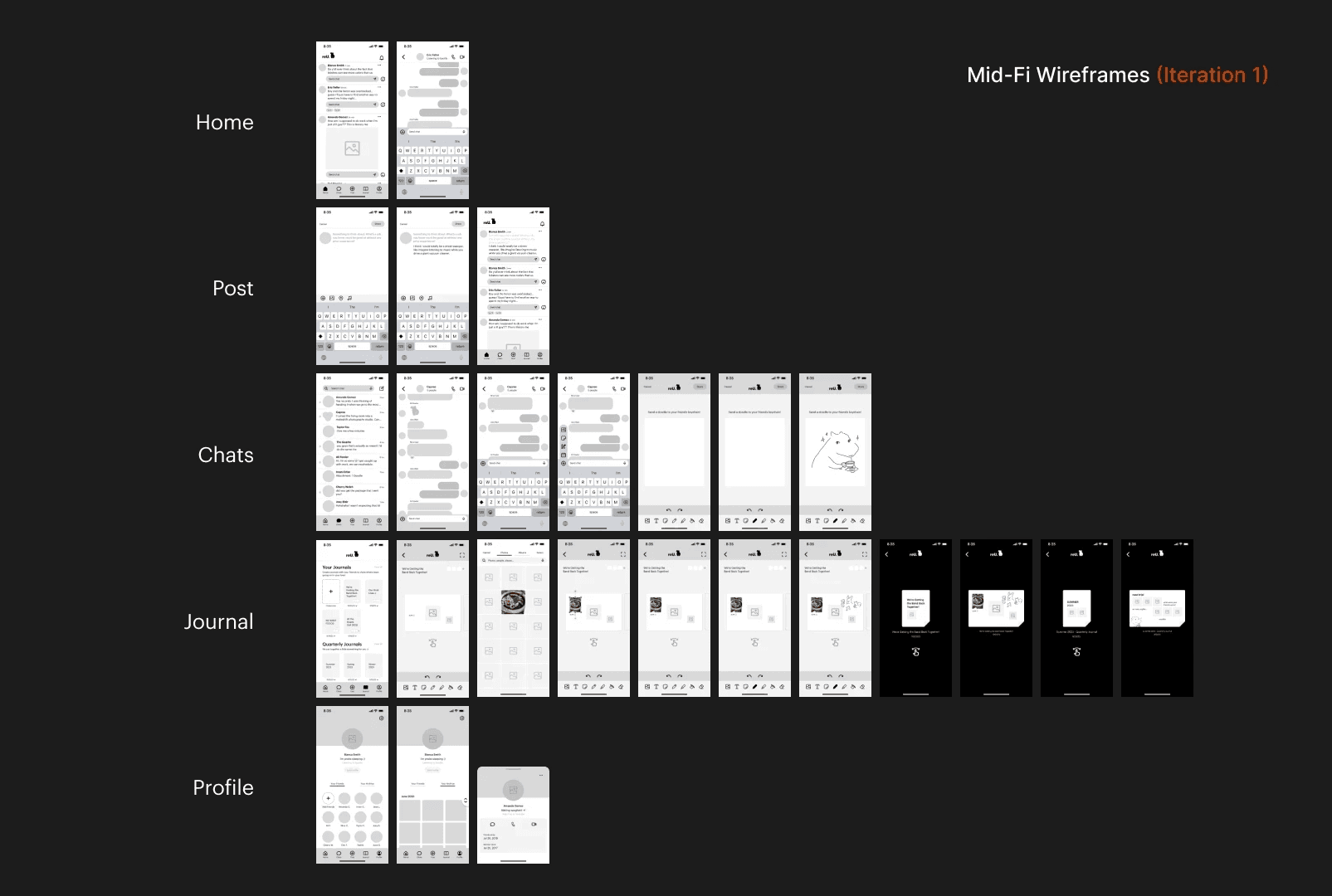
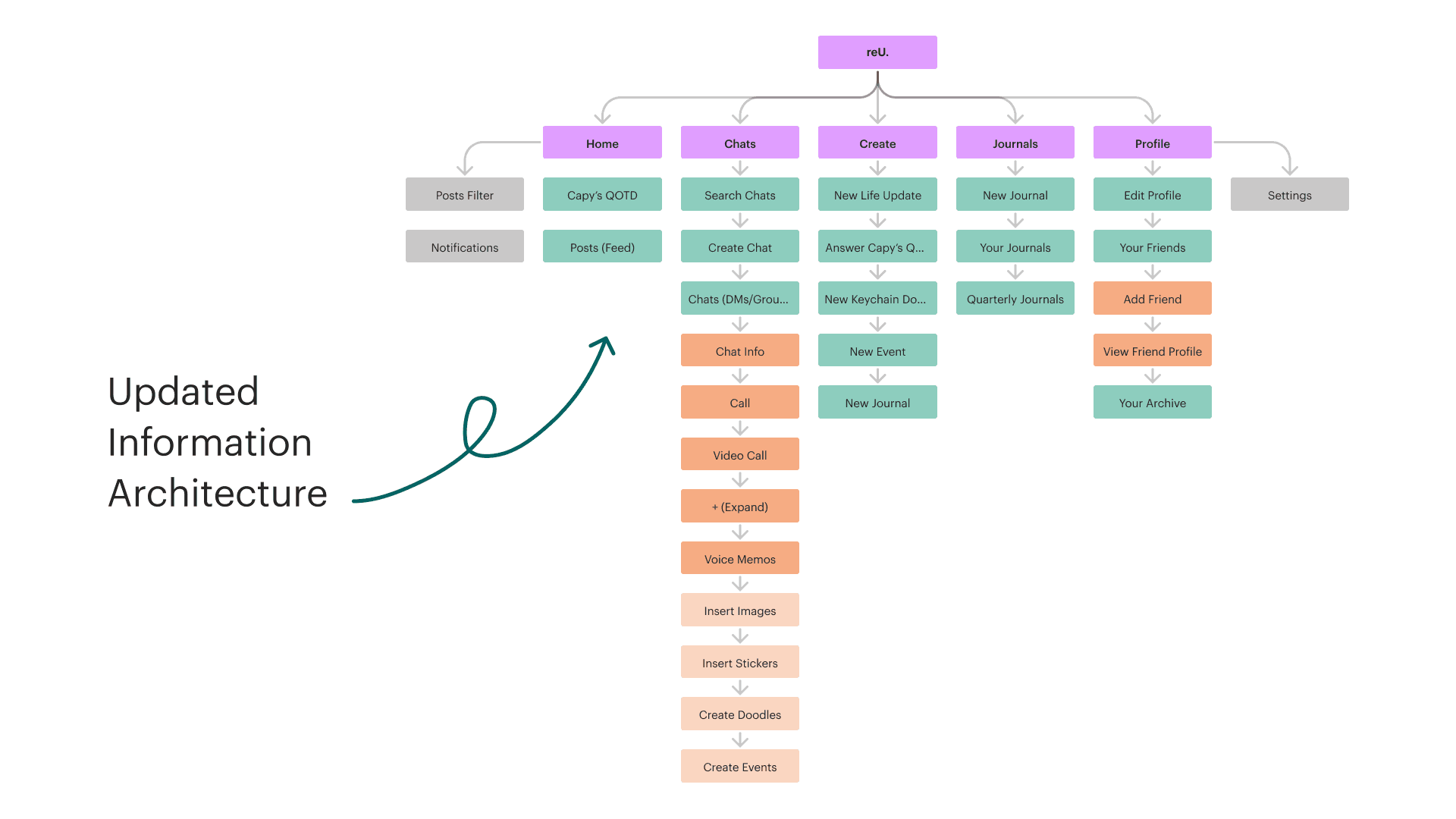
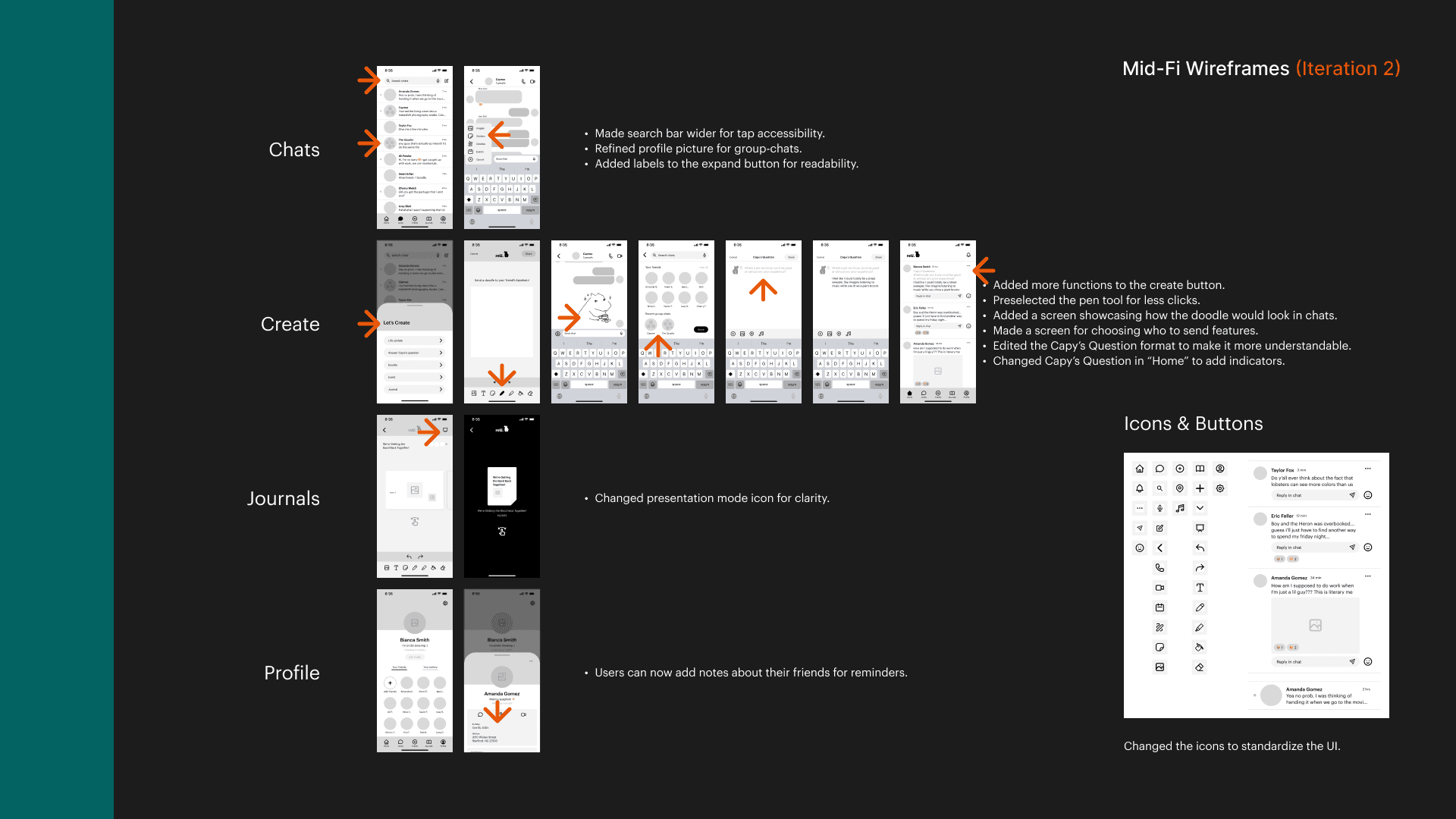
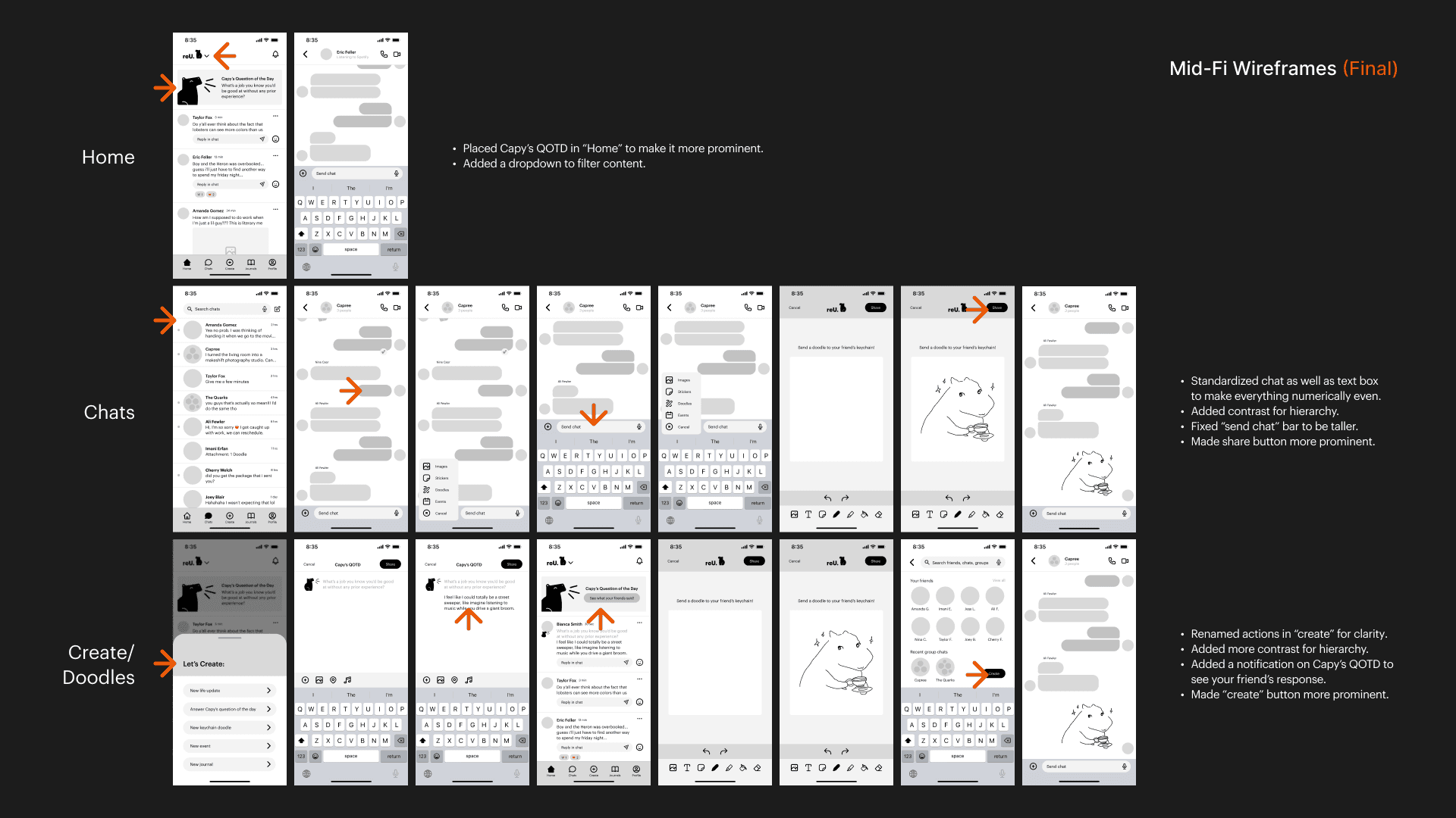
Low Fidelity And Middle Fidelity
User Testing
We conducted three rounds of user testing: one round of card sorting to finesse our info arch, and two rounds of usability testing to make edits to our screens.
From user testing, we were able to finalize the flow of our app and also perfect its layout and visuals.
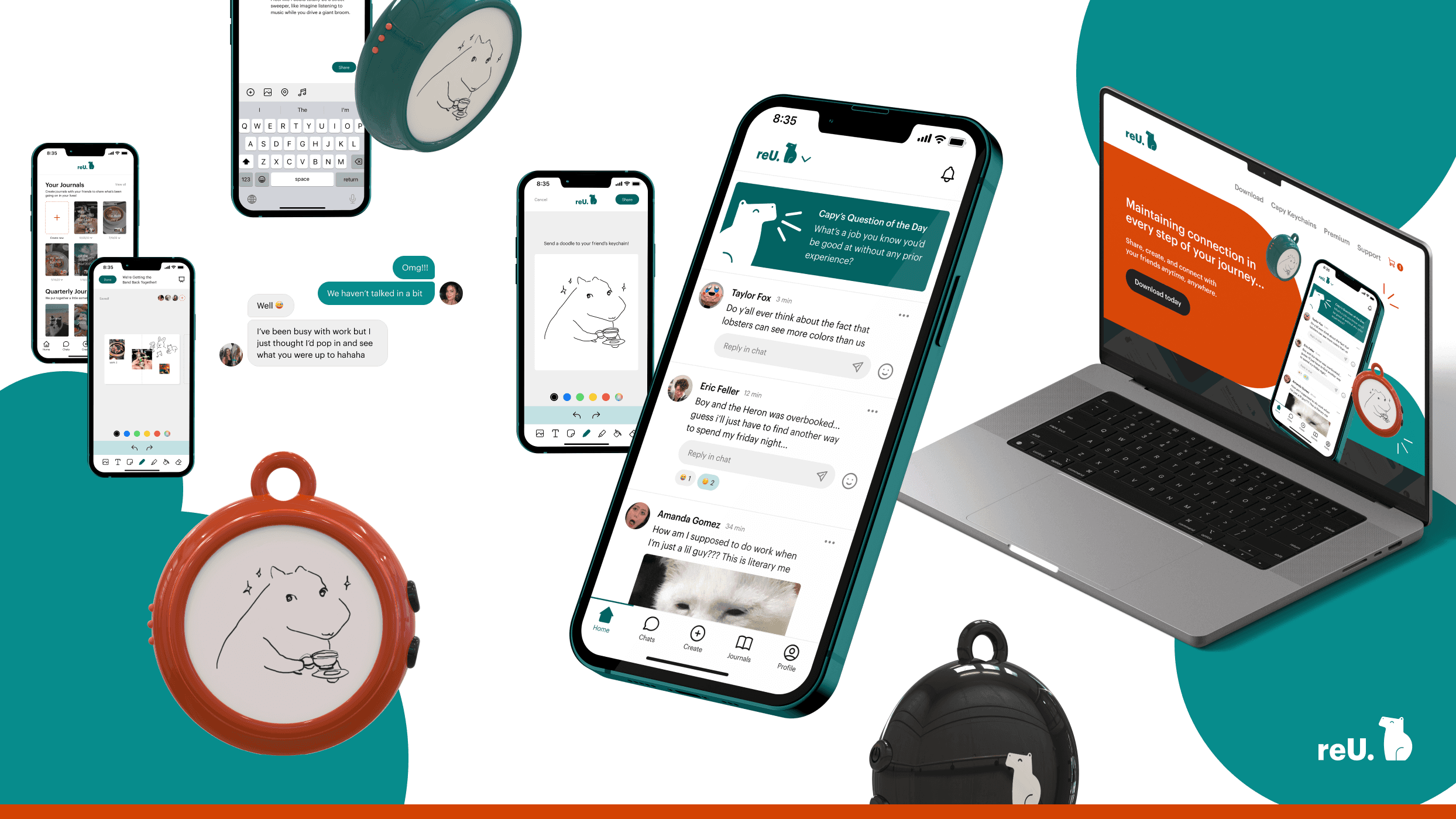
High Fidelity
Reflections
This project demonstrated my ability to design a well-structured, user-friendly app. I learned the importance of building a solid information architecture, which made navigating the app more intuitive. Starting with a solid mid-fidelity design also made the process much smoother, reducing the need for major adjustments later on. Another key takeaway was the importance of layer naming conventions and organization, which helped streamline the workflow and made collaboration much easier.