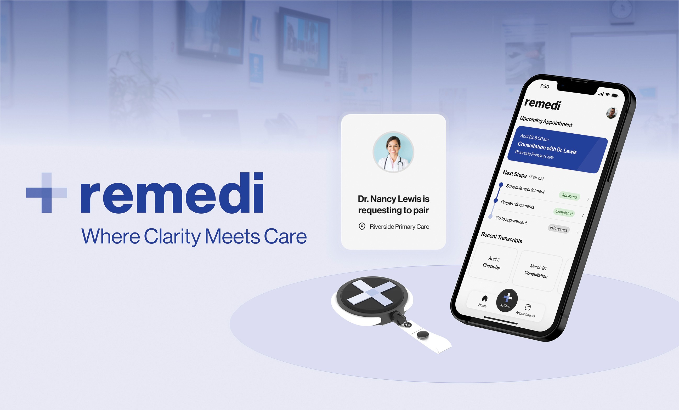
remedi

Where Clarity Meets Care

Role

Project Manager

Industry

Healthcare

Duration

10 Weeks

a cell phone on a table

Overview

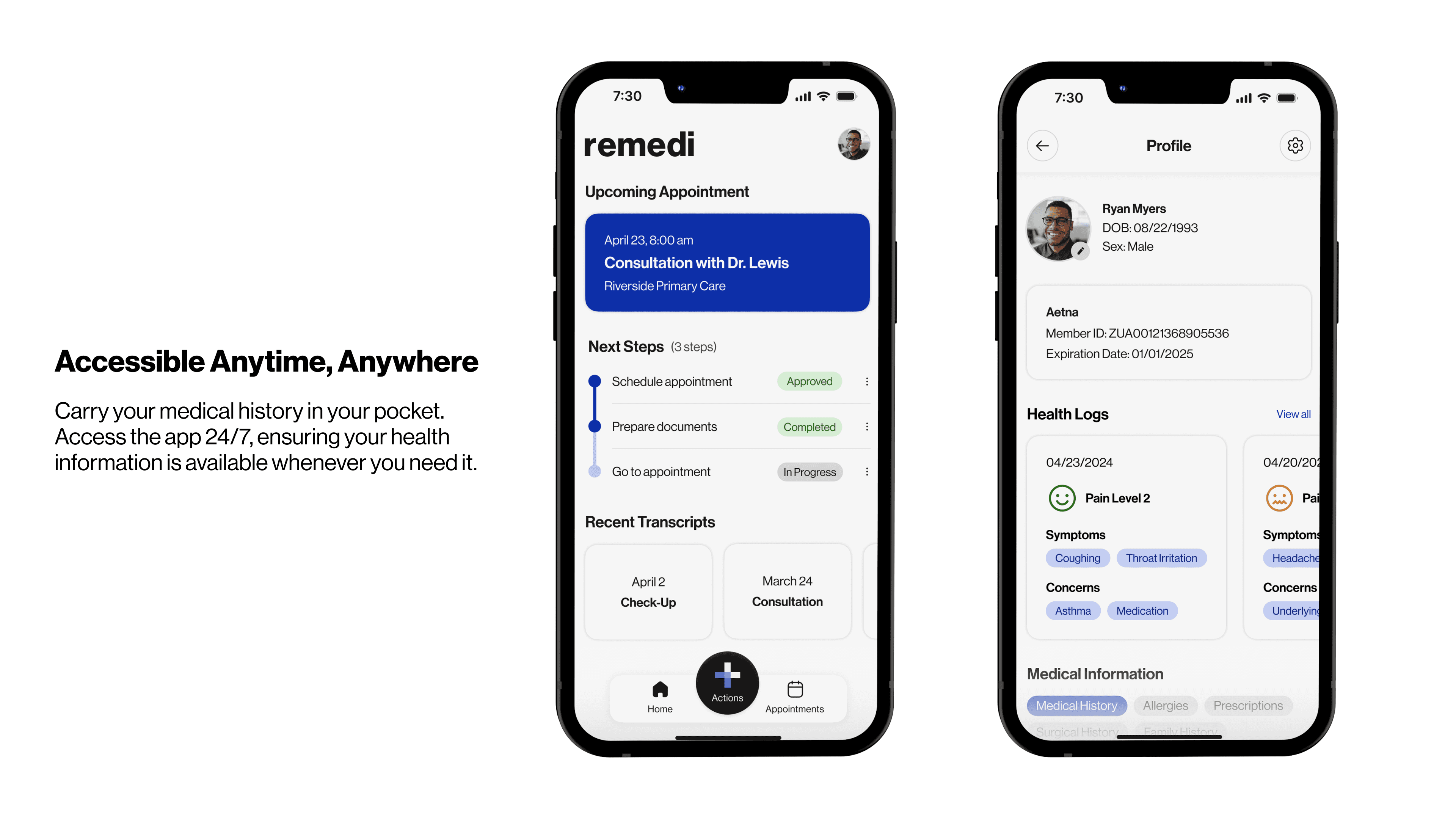
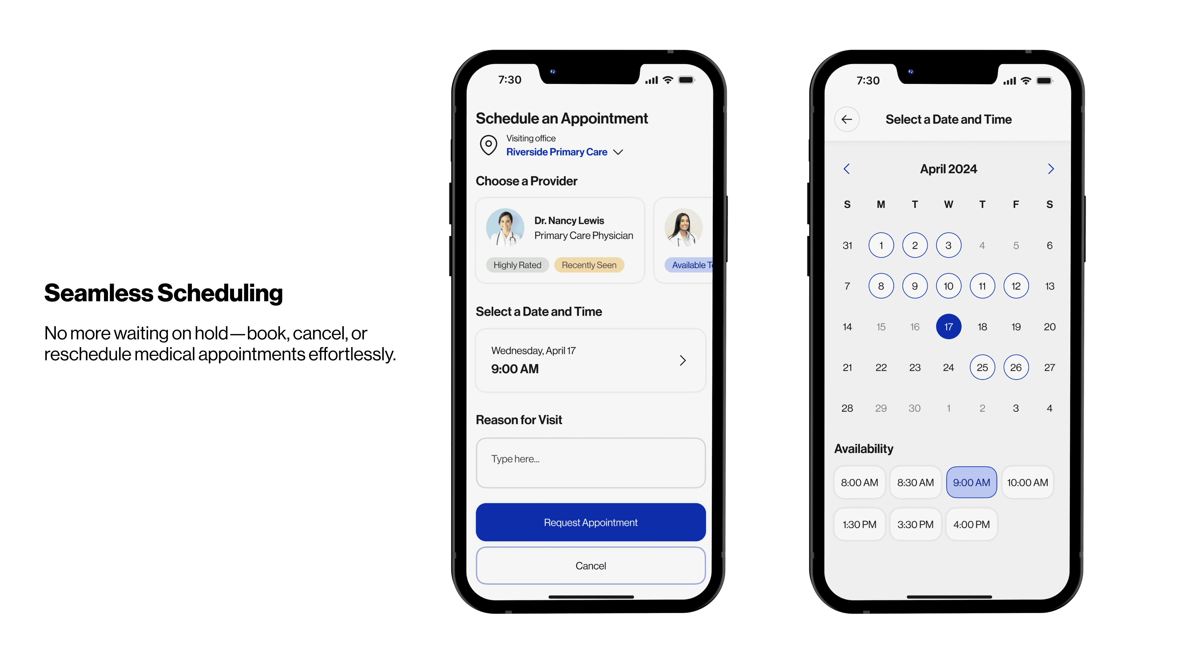
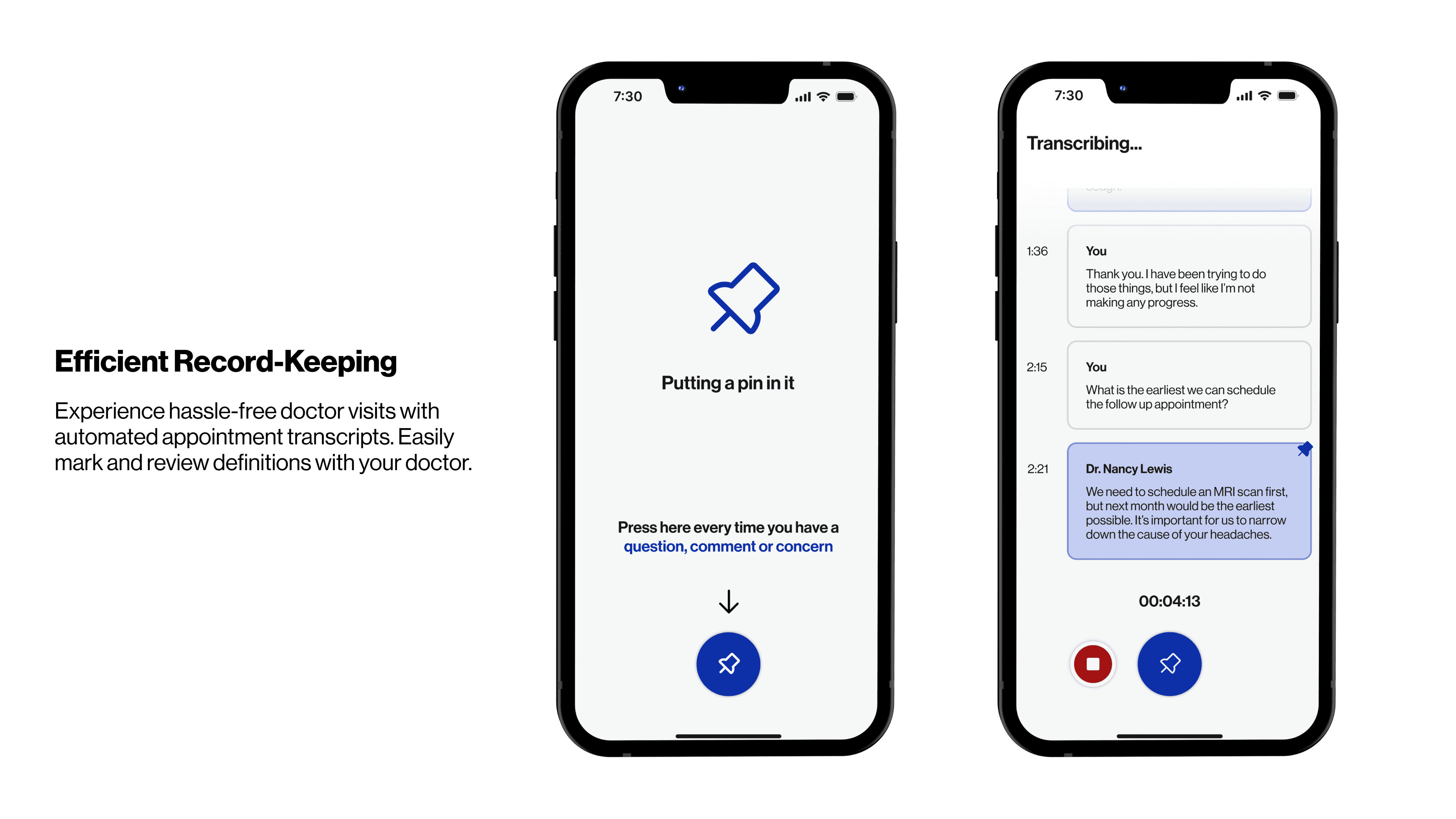
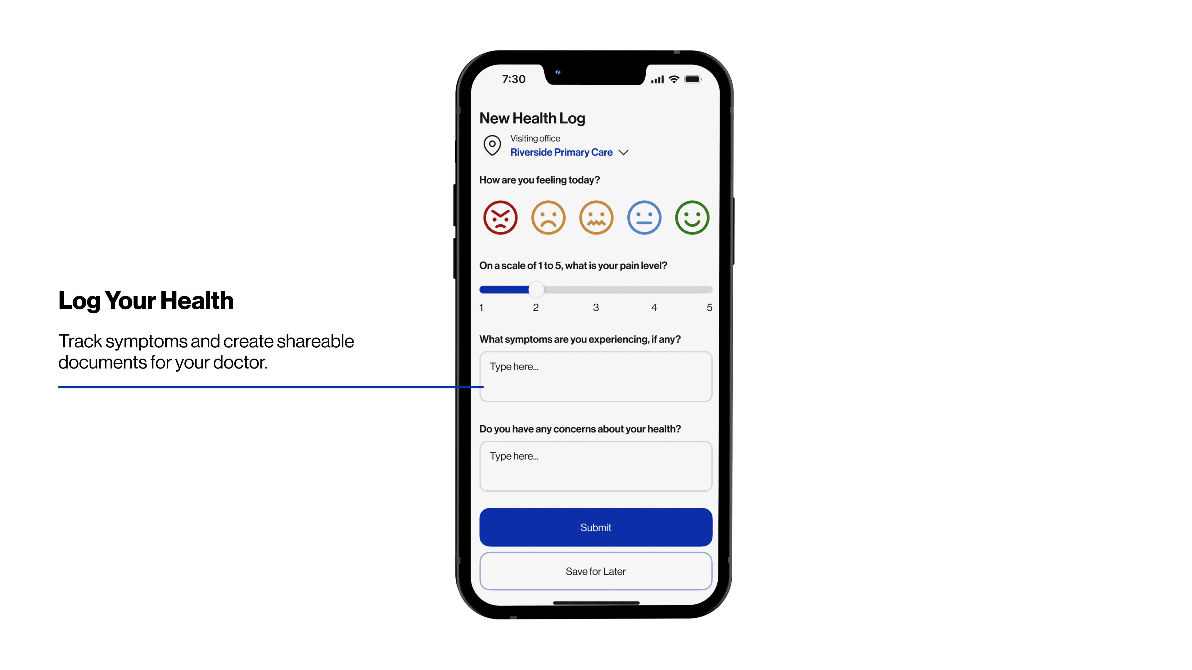
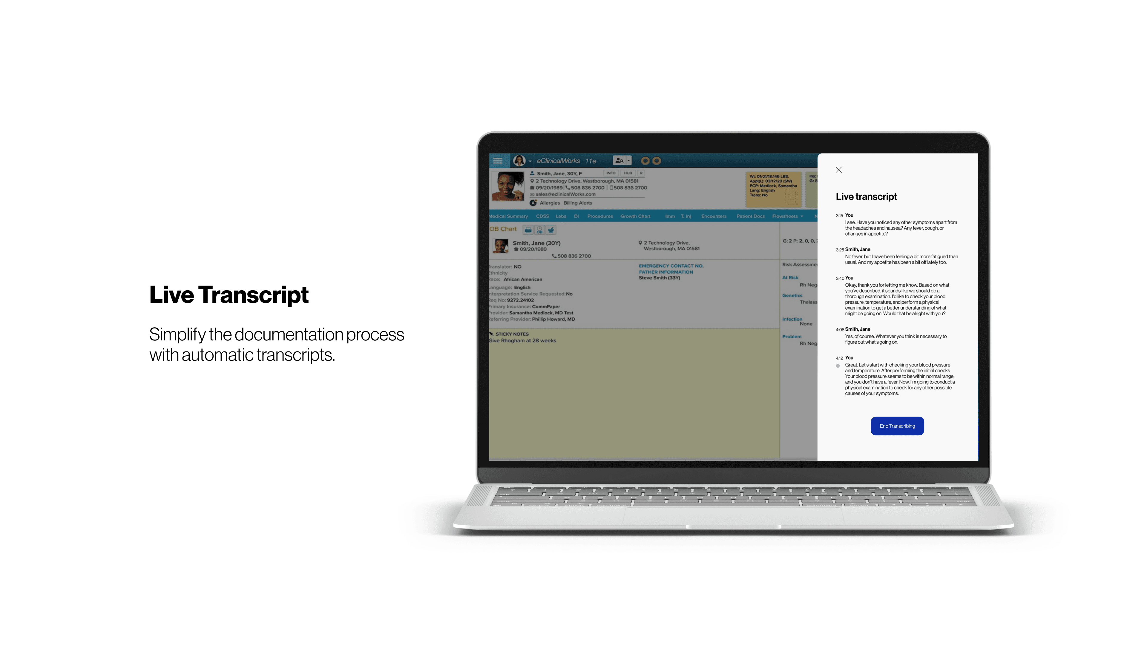
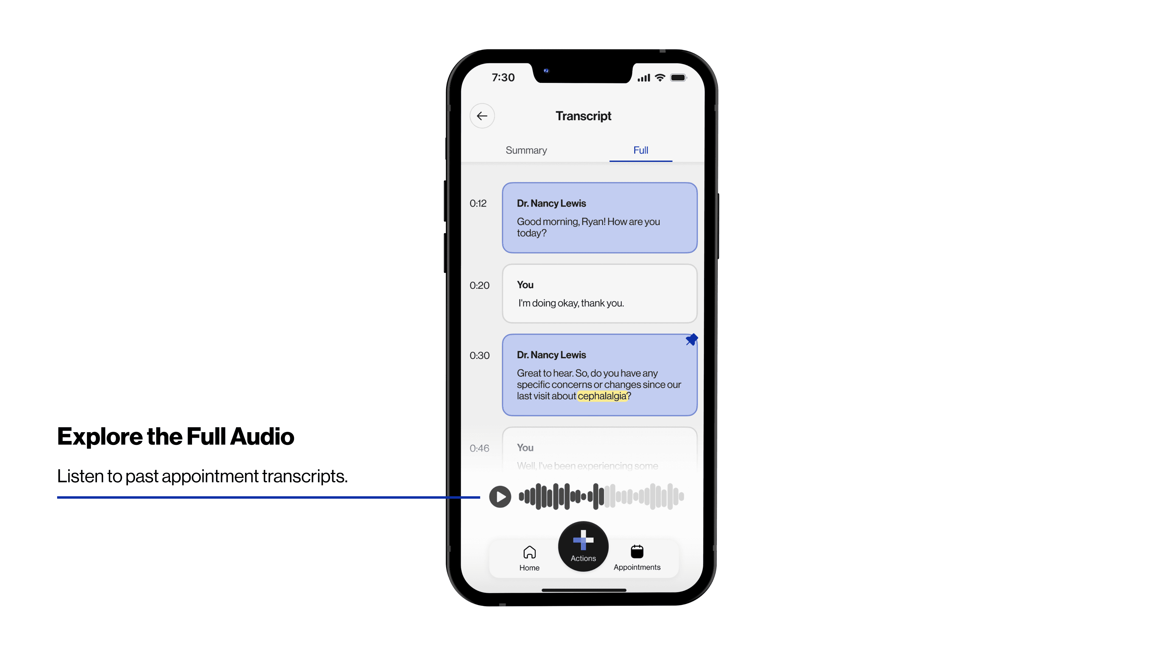
Remedi is a healthcare platform designed to streamline and personalize the patient experience. Empowering patients to take control of their healthcare journey by integrating effortless appointment scheduling and real-time medical transcript record-keeping. We aimed to bridge the gap between patients and medical professionals, ensuring clear communication, accessible health records, and a seamless care process.


Problem Statement

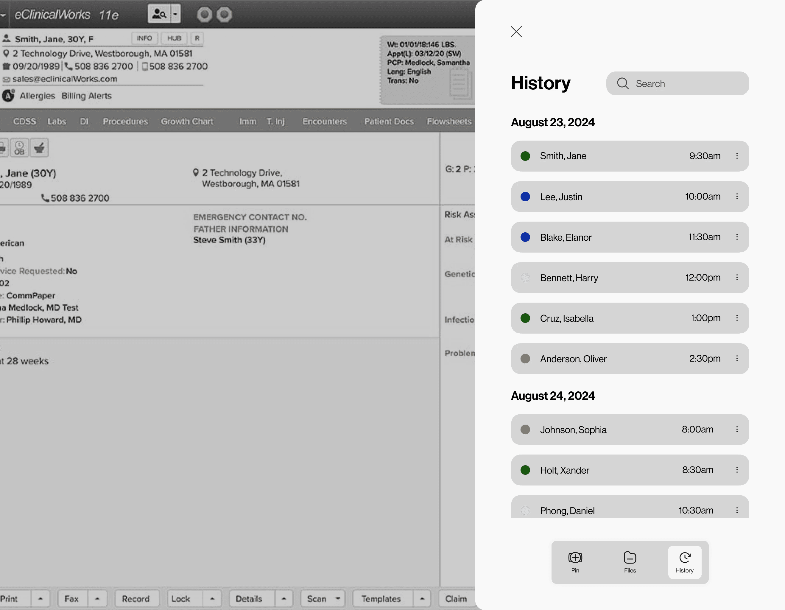
Managing medical information can be overwhelming. Patients struggle with keeping track of past visits, understanding complex medical terminology, and ensuring they receive the right care at the right time. Meanwhile, medical professionals face cognitive overload due to cluttered Electronic Health Record (EHR) systems, which impacts their ability to focus on patient care.

Without a streamlined system, patients risk misinterpreting medical advice, missing important follow-ups, and feeling disconnected from their own healthcare. This gap in communication and accessibility leads to frustration, inefficiency, and potential negative health outcomes.


Research Methods

We sent out a survey to gather insights on patients' experiences with medical appointments, receiving 34 responses in total—21 from patients and 13 from medical workers. In our diary studies, 5 patients documented their appointment experiences, while 6 medical workers recorded their own. We noticed recurring keywords in their responses, such as:

Time, Respect, Communication, Patience, and Transparency

a cell phone on a white block
two cell phones on a gray surface

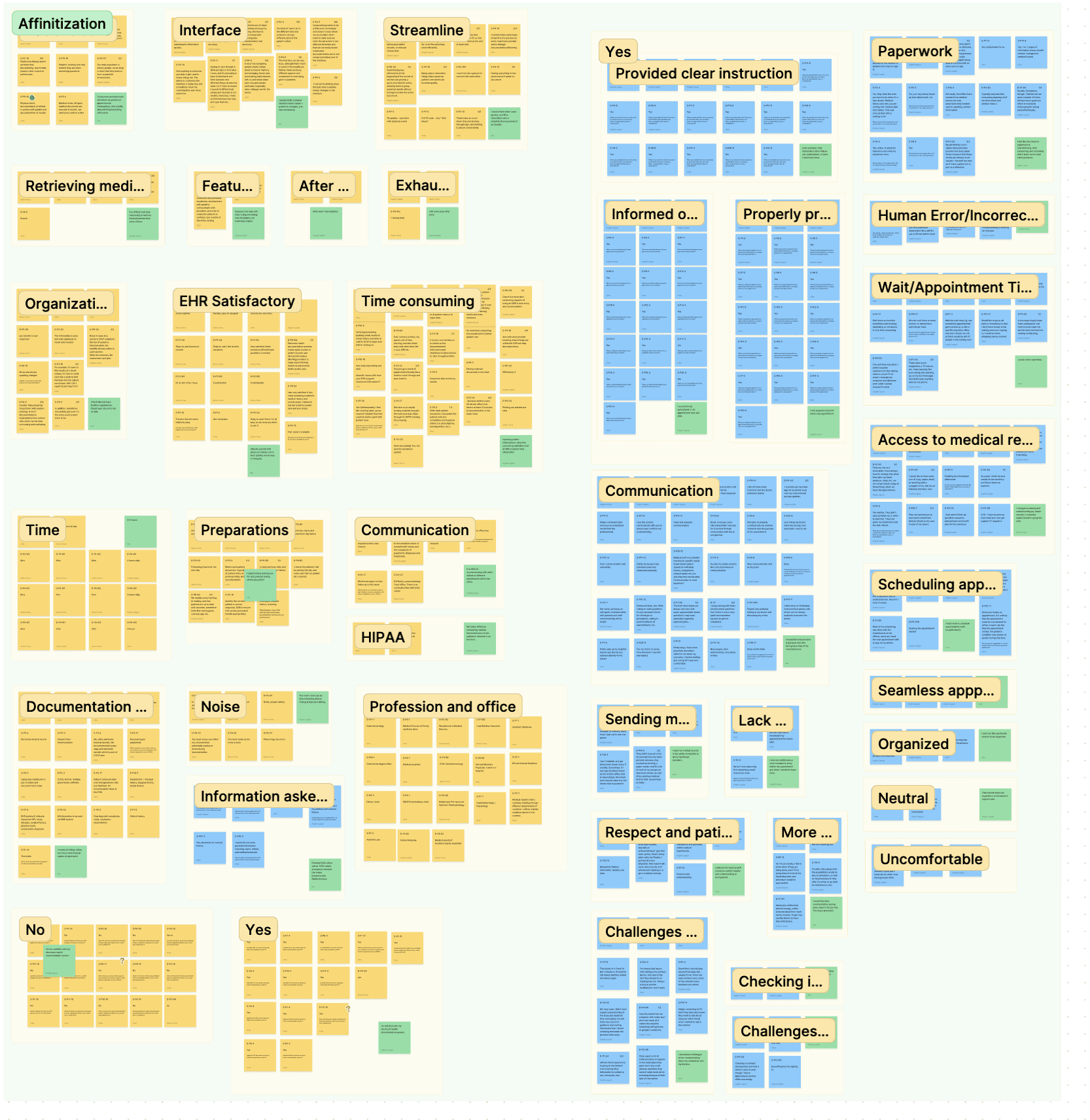
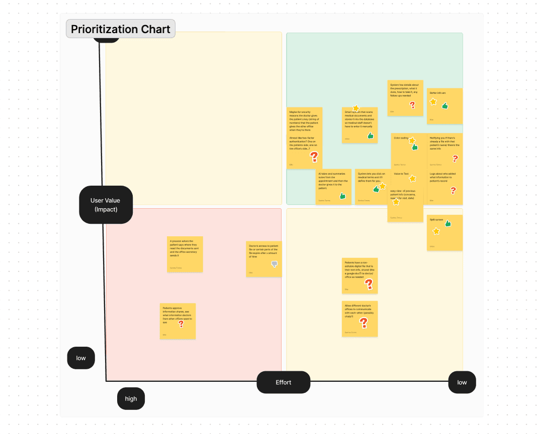
After compiling our research, we grouped similar findings through an affinity process and created a priority chart. From this, we identified these needs:

Patients Need:

✔ Real-time medical transcripts for better recall after appointments.

✔ Simplified explanations of complex medical terms to improve understanding.

✔ Quick access to past medical records without unnecessary navigation.

Medical Professionals Need:

✔ Structured, easy-to-read patient information to reduce cognitive load.

✔ A more intuitive interface for EHR systems to improve efficiency.


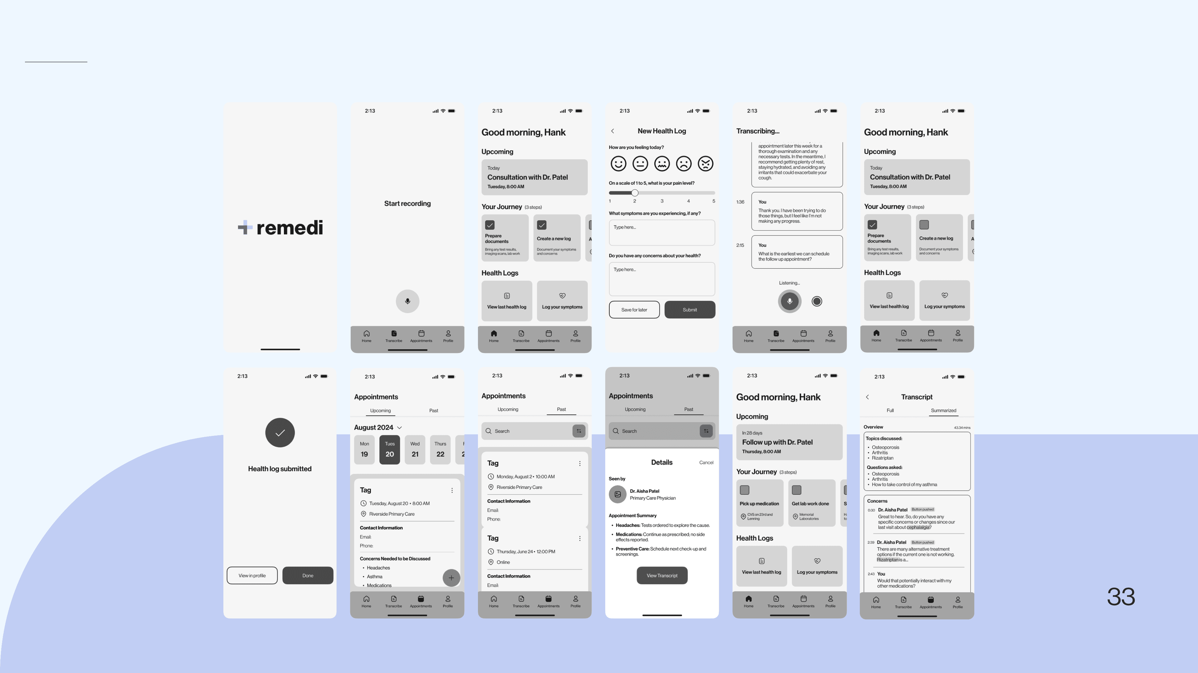
Low Fidelity and Middle Fidelity

a cell phone leaning on a ledge
a pair of cell phones on a concrete block
a cell phone with a yellow rectangular screen

User Testing

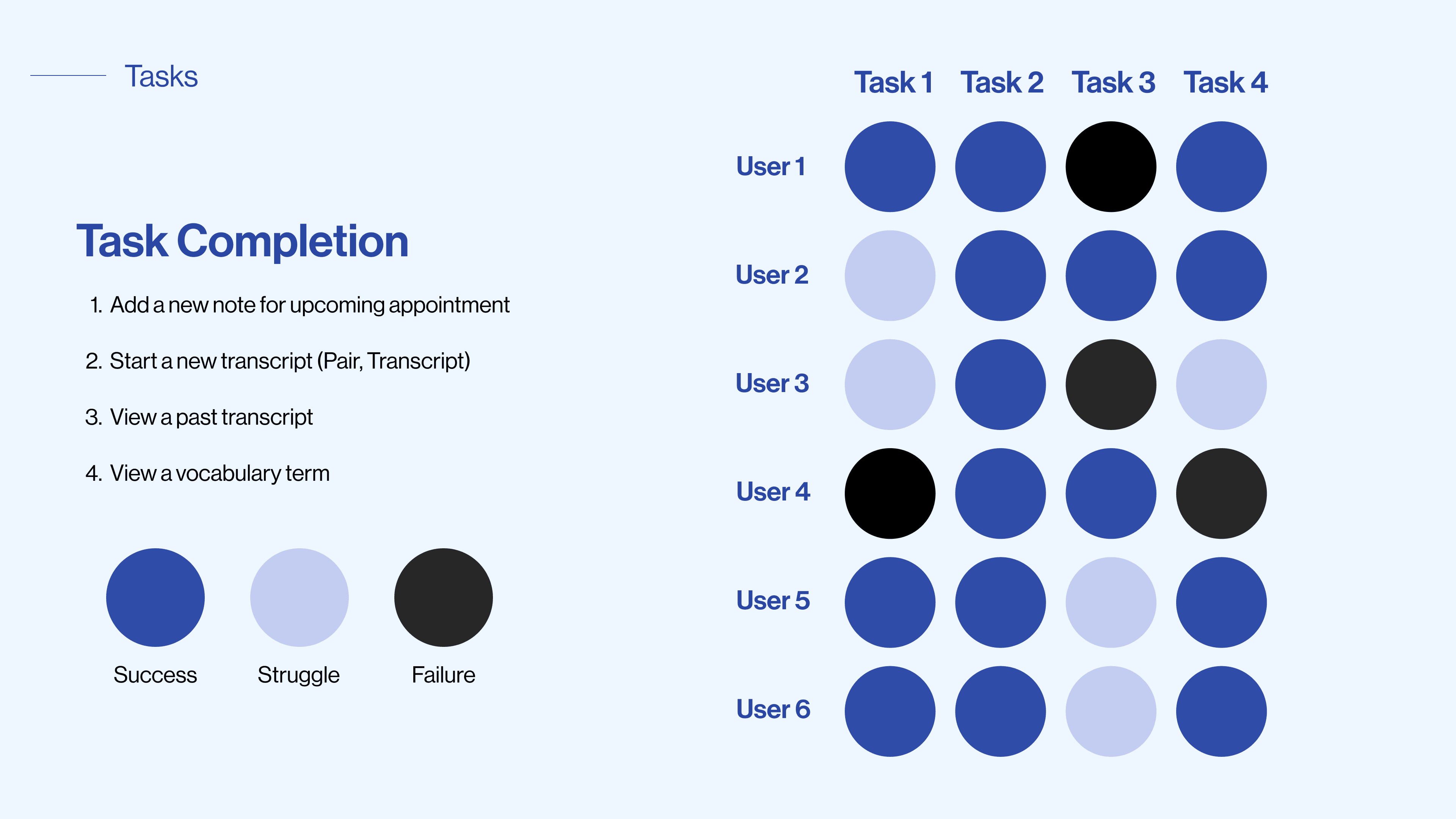
Pain Points Identified During Testing:

❌ Users struggled to locate past transcripts → Revamped information architecture.

❌ Confusing labeling on appointment scheduling → Reworded and redesigned UI elements.

❌ Definitions of medical terms were buried in menus → Simplified access in fewer clicks.

❌ Transcription functionality was unclear for doctors → Refined workflow for real-world usability.


Reflections

Designing an environment rather than just an app can sometimes be the best approach you can take. This project had its share of ups and downs, particularly when we had to shift our focus from healthcare providers to patients. While initially uncertain about our direction, we learned that it is sometimes acceptable to prioritize one user group while still incorporating features beneficial to others. This experience taught us the value of flexibility and user-centered design in creating a more inclusive and effective solution.

Other projects

Copyright 2024 by Santos Torres

Copyright 2024 by Santos Torres

Copyright 2024 by Santos Torres